ShopDreamUp AI ArtDreamUp

Deviation Actions


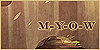
![intoxication [7/6/13]](https://images-wixmp-ed30a86b8c4ca887773594c2.wixmp.com/f/44cea171-b3ca-4705-ab74-0b9a2b6f0e86/d6cbp5h-f3708b32-6254-4f2a-b8c4-63f98708a289.png/v1/crop/w_184,h_184,x_15,y_0,scl_0.30666666666667/intoxication__7_6_13__by_skelefrog_d6cbp5h-92s-2x.png?token=eyJ0eXAiOiJKV1QiLCJhbGciOiJIUzI1NiJ9.eyJzdWIiOiJ1cm46YXBwOjdlMGQxODg5ODIyNjQzNzNhNWYwZDQxNWVhMGQyNmUwIiwiaXNzIjoidXJuOmFwcDo3ZTBkMTg4OTgyMjY0MzczYTVmMGQ0MTVlYTBkMjZlMCIsIm9iaiI6W1t7ImhlaWdodCI6Ijw9NjAwIiwicGF0aCI6IlwvZlwvNDRjZWExNzEtYjNjYS00NzA1LWFiNzQtMGI5YTJiNmYwZTg2XC9kNmNicDVoLWYzNzA4YjMyLTYyNTQtNGYyYS1iOGM0LTYzZjk4NzA4YTI4OS5wbmciLCJ3aWR0aCI6Ijw9ODAwIn1dXSwiYXVkIjpbInVybjpzZXJ2aWNlOmltYWdlLm9wZXJhdGlvbnMiXX0.Xxi9rCOnlzFPIBVE5ltFu_TNephjdEisg7OGOcD_cBk)
![intoxication [7/6/13]](https://images-wixmp-ed30a86b8c4ca887773594c2.wixmp.com/f/44cea171-b3ca-4705-ab74-0b9a2b6f0e86/d6cbp5h-f3708b32-6254-4f2a-b8c4-63f98708a289.png/v1/crop/w_92,h_92,x_8,y_0,scl_0.15333333333333/intoxication__7_6_13__by_skelefrog_d6cbp5h-92s.png?token=eyJ0eXAiOiJKV1QiLCJhbGciOiJIUzI1NiJ9.eyJzdWIiOiJ1cm46YXBwOjdlMGQxODg5ODIyNjQzNzNhNWYwZDQxNWVhMGQyNmUwIiwiaXNzIjoidXJuOmFwcDo3ZTBkMTg4OTgyMjY0MzczYTVmMGQ0MTVlYTBkMjZlMCIsIm9iaiI6W1t7ImhlaWdodCI6Ijw9NjAwIiwicGF0aCI6IlwvZlwvNDRjZWExNzEtYjNjYS00NzA1LWFiNzQtMGI5YTJiNmYwZTg2XC9kNmNicDVoLWYzNzA4YjMyLTYyNTQtNGYyYS1iOGM0LTYzZjk4NzA4YTI4OS5wbmciLCJ3aWR0aCI6Ijw9ODAwIn1dXSwiYXVkIjpbInVybjpzZXJ2aWNlOmltYWdlLm9wZXJhdGlvbnMiXX0.Xxi9rCOnlzFPIBVE5ltFu_TNephjdEisg7OGOcD_cBk)


Description
some more quick background practice uvu
the background didnt take long
choosing who to put in it took hours :I
Roo (c)
the background didnt take long
choosing who to put in it took hours :I
Roo (c)
Image size
1000x1000px 711.4 KB
© 2013 - 2024 Densetsugin
Comments54
Join the community to add your comment. Already a deviant? Log In
this is a really wonderful piece, so I guess there is no reason why I can't take the time to write out a nice critique for you.
Firs of all, I have to say you completely nailed the beautiful effects of contrast in this picture. The bright aqua colour in the background really brings out the darker colours in this picture, and it's a really wonderful colour-scheme that make this picture look both beautiful and eerie at the same time. The colour of the eyes really draw attention to the creature in this picture too, easily making it the main focus of this piece which I'm pretty sure you intended to do. The orange is so different compared to the aqua, and in a way it creates some different and interesting contrast as well. I really do love how mysterious everything looks as well, its so dark and bright at the same time, it's almost as if the mood it gives off has two contrasting sides as well which is really interesting. I also love the way you manipulate anatomy and stylize it in such a way that looks really interesting and quite frankly, unique. I love how the creature in this both has thick and thin parts regarding the legs and arms, and the way you have drawn the fur is really cool as well might I add.
Now what I think you could improve on. I had a bit of trouble finding some things you could fix since you did this so well, but after giving the picture a good look over I figured that there were a few things that I thought might have been interesting to include or may have brought the whole thing together a bit better. First of all, when I look at some of the background trees I noticed a bit of blurring near the root of the trunk, I think if these trees were defined a little better and had some more work done on them, they could have looked better. Also something that I thought might be interesting, adding some of the lighter flecks (same colour as the bright background colour) to some of the strands of grass on the little mounds might help them to pop a little more too. Overall with the background, I think more attention to detail and some more refinement could have made this look a bit better, maybe more defined grass and trees, but I think you've got the general concept down and it looks amazing.
Now for your little monster guy here. I figured the same idea with the grass might help outline his figure a bit better, maybe some lighter flecks on some of the bits of his fur? I also thought that maybe he would pop out more as the main focus of the picture if he was a little darker too? He blends in with the trees just a little since he is almost the same colour as some of the darker ones.
Overall, this is the best background I think I have seen from you so far, it looks really great and you've really made this look super stunning, good job! I can't wait to see more work from you, especially if you're this great at doing backgrounds and scenes. It's really quite stunning what you can do, you've improved so much I swear. Good luck!